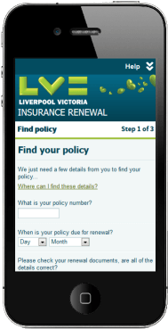
In the world of web development, ‘mobile’ is …
… actually, it’s not that easy! Using some real examples from a recent project, I aim to discuss some of the requirements we might get as developers with a view to understanding that the term ‘mobile’ is not as straightforward as we might think, and that doing ‘mobile’ web development might be more involved than a few media queries.
So, onto the use cases …
-
On mobile we want to hide the sidebar
Sounds reasonably straightforward, and this is the kind of thing we might be expected to deliver:
We might even be given mockups or wireframes that show a desktop PC vs. a mobile phone. But is that really what the user means by ‘mobile’? In this use case does the term ‘mobile’ really mean mobile phone, or does it mean something else?
As I’m sure you’ve probably guessed, in this context ‘mobile’ meant narrow viewport, and the requirement was met with media queries.
So, does ‘mobile’ always mean narrow viewport?
-
On mobile we want radio buttons to be rendered as drop down fields
On the surface of it, this use case would seem to be saying that mobile (phones?) should use drop down fields instead of radio buttons. But the provided wireframes were based on an iPad
On drilling down into the requirement, it turned out that the core requirement was around the UX of touch based devices, and that for touch devices they wanted drop down fields instead of radio buttons.
In this case the term ‘mobile’ was used in the requirement to mean any touch device because they are deemed to be portable. Basically something that is not a traditional PC.
So are we now saying that the term ‘mobile’ means a touch screen device? Or is it a combination of use cases 1 and 2 in that it’s a touch screen device with a narrow viewport? Or are we saying it’s either a touch device or a narrow device?
-
On mobile we want to display local rate phone numbers that when tapped dials the number
UK call centres usually have telephones numbers which are free to call (0800 based) or are charged at a local rate (0844 or 0845 based). However, these numbers are only free or local rate from a landline. If you call these numbers from a mobile phone they are typically chargeable calls and do not come out of your minutes bundle (some UK operators have now changed since this, but at the time of the project generally these calls were not free or included in your bundle on a mobile phone).
The requirement was to display a local geographic phone number to mobile phones such that if they called the number it would come out of their regular minutes bundle. In addition, if the customer tapped the phone number it should launch the dialler to make the call.
We now appear to have another definition of ‘mobile’ – one that is indicative of the device capabilities in that we need to know that the device is actually a phone that is capable of placing phone calls.
3 definitions of ‘mobile’ that are all different …
- Does ‘mobile’ refer to the screen width and can be addressed simply with media queries?
- Does ‘mobile’ refer to the fact that it’s a touch screen device?
- Does ‘mobile’ refer to the fact that it really is a phone capable of making phone call?
Or does ‘mobile’ refer to some combination of the above?
Challenge the requirement and get the detail
From my experience I would say that ‘mobile’ is too loose a term to be used in user requirements, and that should we be faced with these kind of requirements we need to dive into the detail to find out the real requirement, and in particular what the user means by ‘mobile’. Only then can we come up with the most appropriate solution.
Different requirement types require different solutions. Changing the page layout based on viewport is perfect for media queries; but arguably has nothing to do with the device being ‘mobile’. Presenting different markup based on device capabilities as in use cases 2 and 3 is better suited to progressive enhancement techniques that can detect the device or it’s capabilities. Media queries are not well suited to these requirement types. Phones are getting wider (consider the current range of ‘phablets’), so identifying one of these as a mobile simply with a media query is becoming increasing difficult.
In an ideal world I would like to see the term ‘mobile’ replaced in user requirements with unambiguous terms such as ‘viewport narrower than xxx’, ‘touch screen device’, ‘phone’ etc.


