
Unfortunately in our world of web development, tech terms are often overloaded which causes a lack of common understanding, which in turn leads to misuse and confusion. Responsive and adaptive web design are two such terms.
Broadly speaking they both refer to the ability of a site to display or operate differently based on factors of the browser. But what’s the difference between the two? where would you use each? or are they the same thing?
Ethan Marcotte originally coined the term ‘responsive design’ in his A List Apart article where he describes the use of css3 media queries to change the flow and layout of a page based on (typically) device width. In my experience this is the most commonly held understanding of what responsive design is all about, and I personally believe it to be the correct description.
So if we share this basic understanding of what responsive design is, what’s all this adaptive design stuff. Well, in my experience, that’s where it becomes a grey area; and my hope for this article is to clear some if this up.
The Wikipedia entry for Adaptive Web Design has the following description:
Adaptive web design is basically the same as responsive design and shares many of the same ideals and goals. The main difference however is that the changes are made on the server side rather than the client side.
Adaptive websites are designed to respond and adapt to different screen sizes using responsive techniques, and to adapt to different User requirements based on different device capabilities.The responsive design aspect of adaptive design involves the implementation of various design factors such as flexible layouts, CSS file alternatives and flexible images, which are activated using media queries.
With adaptive delivery, the most significant difference is that the server hosting the website detects the devices making requests to it, and uses this information to deliver different batches of HTML and CSS code based on the characteristics of the device that have been detected.
Adaptive web design also encompasses a range of other strategies which, when combined with responsive design techniques, enables you to deliver the best possible User experience to the widest possible audience. This means that numerous functionalities and environmental factors can be catered for in the most User friendly way, depending on the particular device being used to access your website.
If we are to believe the above it would lead us to the conclusion that adaptive design is simply another name for responsive design in that they both use media queries:
- “Adaptive web design is basically the same as responsive design”
- “Adaptive websites are designed to respond … using responsive techniques”
- “flexible layouts, CSS file alternatives and flexible images, which are activated using media queries”
But intermingled with that is a description of a technique that uses server side logic:
- “The main difference however is that the changes are made on the server”
- “different device capabilities”
- “the server hosting the website detects the devices”
- “deliver different batches of HTML and CSS code based on the characteristics of the device”
How confusing is that? Talk about mixed messages …
Aaron Gustafson is widely credited as first coining the term Adaptive Web Design in his same-titled book. In it Gustafson talks about progressive enhancement techniques, one of which is creating web applications that adapt to the browser’s capabilities.
There is an important distinction to be made here. Media queries allow you to change the visual characteristics of the page based on (typically) the browsers viewport width. For example, you can change element widths or floats etc to change the flow of the page, and you can show and hide content. However, the base markup that gets served to the client browser is the same. If you are using media queries to show and hide elements A and B, both elements must be in the DOM, typically by serving it in the initial markup (though, these elements could be created client side with javascript)
<style type="text/css">
    #A { display: block; }
    #B { display: none; }

    @media (max-width: 480px) {
        #A { display: none; }
        #B { display: block; }
    }
</style>

<div id="A">I display on wide devices</div>
<div id="B">I display on narrow devices</div>
The above example shows how media queries can be used to show and hide elements based on screen width. The important point here is that both elements exist in the DOM regardless of the screen width, and regardless of whether the client browser will end up showing the elements. The server doesn’t know the device width so can’t serve the most appropriate markup.
Gustafson’s description of adaptive design talks about adapting the content to the device capabilities. The key here is being able to detect the device and/or its capabilities in order to serve the appropriate content. There are several techniques or approaches for detecting a device or its capabilities, and the approach you would choose would depend on what you are trying to detect. The point however is that depending on the detected capability, you would serve different content.
OK, so perhaps that’s not as clear as it could be. How about real world examples of both responsive and adaptive design from an application I worked on recently.
The LV= Express Renewals application allows customers to renew their insurance policy, and has been developed as a responsive site with css3 media queries to change the layout of the page based on screen width:

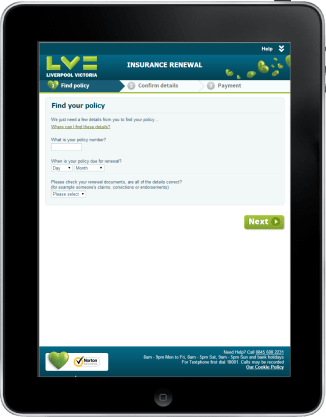

On a wide device such as a desktop, the progress bar is shown as a stepped progress bar and the right hand column shows the contact details. On a medium width device such as a portrait tablet there is still room for the stepped progress bar, but the right hand column is hidden, and the slide down ‘Help’ section in the header is shown. And on a very narrow device such as a phone, only the active element of the progress bar is shown without the surrounding branding or decoration.
All of the above is done with css3 media queries, and is an example of responsive design. You’ll be able to see this effect with a modern desktop browser simply by resizing the browser width.
Some of the fields in the application are presented as radio buttons. But the UX team felt that radio buttons were not particularly usable on touch based devices, and for those devices they wanted drop down fields:


The requirement here is very much about the device capability, rather than the screen size. I could have marked up the page with both radio buttons and a drop down field for this question, and used media queries to show and hide the relevant elements, but this would have been based on screen width rather than device capability. And if I had taken this approach, it wouldn’t have addressed the core requirement. For example, someone using a desktop computer where they’ve resized their browser to a narrow width would have hidden the radio buttons and shown the drop down. But just because they have chosen to make their browser narrow does not make it a touch device. Equally an iPad in landscape mode is 1024px, which is the breakpoint at which the design considers wide enough to show all the elements. Therefore it would show the radio buttons and not the dropdown, even though it is a touch device.
Clearly there is a case where we need to adapt the content or markup to the device, and in order to do so we need to know more about the device and its capabilities – in this example we need to know whether it’s a touch device or not. So how do we do that?
Browser sniffing via the user agent string is probably the most common (but not the only) way of finding out about the device. I know a lot of people don’t like it as it does require a degree of maintenance and is certainly not foolproof. Maybe I’ll discuss the relative pro’s and con’s of the various techniques of browser or capability detection in another blog post. But for the purpose of this discussion, I used what is essentially a browser sniffing technique by pattern matching against the user agent string to categorise the device into being either normal (ie. a desktop or laptop), a tablet, or a phone. Once the device has been categorized, it is easy to serve the appropriate markup – tablets and phones get the drop down (on the assumption that they are all touchscreen and hence fulfil the requirement), anything else gets the radio buttons.
In summary, my understanding and interpretation of responsive design is about using css3 media queries to change the flow and display characteristics of the page based on screen width. Importantly, the technologies used are client side technologies.
Adaptive design on the other hand is a technique by where the content or markup of a page is dependant on the browser or its characteristics, and that the detection techniques are typically server side, but can be client side, or a combination of the two.
Its like you read my mind! You seem to know a lot about this, like you wrote the book in it or something.
I think that you can do with some pics to drive the
message home a little bit, but other than that, this is wonderful blog.
An excellent read. I will certainly be back.